Curated by

Shadcn Space
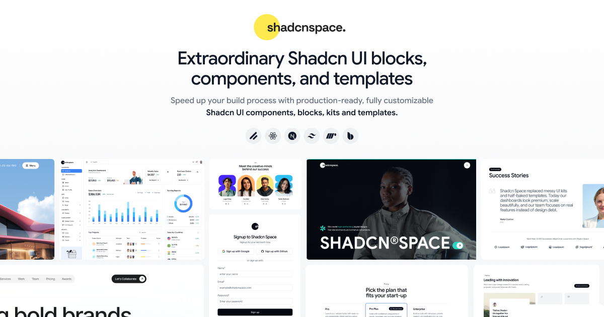
Shadcn Space delivers beautifully crafted Shadcn UI components, blocks, and templates designed with premium aesthetics and smooth animations - helping you ship modern UIs faster.
stacklist.com/shadcnspace
Shadcn Space delivers beautifully crafted Shadcn UI components, blocks, and templates designed with premium aesthetics and smooth animations - helping you ship modern UIs faster.
More in Shadcn Components
See all 36 →Chart Component ShadcnSpace for Modern Dashboards
layers.to
Shadcn Accordion - UI Components and Variants
shadcnspace.com
Shadcn Avatar - UI Components and Variants
shadcnspace.com
More from Shadcn Space
See all stacks →
3+ Shadcn Collapsible Components for React & Next.js
Shadcn Collapsible is a React and Tailwind CSS-based UI component that allows users to expand or hide content on demand, keeping interfaces clean and focused. It supports keyboard navigation, ARIA accessibility, and integrates seamlessly with other Shadcn components for dashboards, forms, and content-heavy applications.
Built for AI agentsACO · 1493 tokens
Summary
Shadcn Collapsible is a React and Tailwind CSS-based UI component that allows users to expand or hide content on demand, keeping interfaces clean and focused. It supports keyboard navigation, ARIA accessibility, and integrates seamlessly with other Shadcn components for dashboards, forms, and content-heavy applications.
Tags
collapsible-component · shadcn-ui · react · tailwind-css · ui-documentation · component-library · accessibility
Key entities
React (technology, 0.95) · Tailwind CSS (technology, 0.95) · Shadcn (technology, 0.95) · Collapsible Component (concept, 0.98) · Accessibility (concept, 0.9) · UI Component Library (concept, 0.92)
Classification
reference · language en · status final
Provenance
claude-haiku-4-5 via @stacklist/be@0.1.0, confidence 0.85, 19 Jun 2026